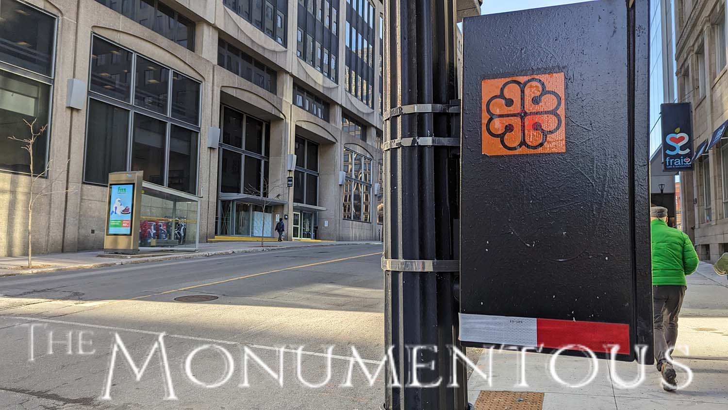
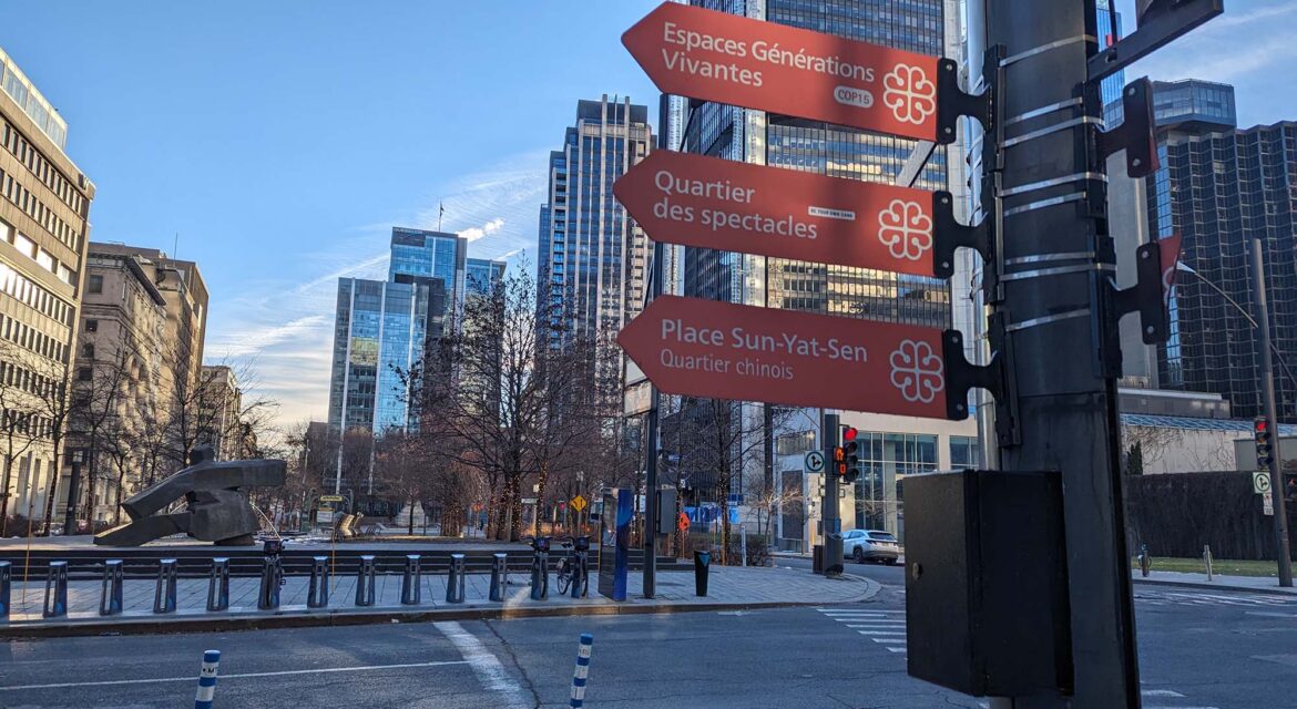
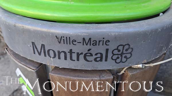
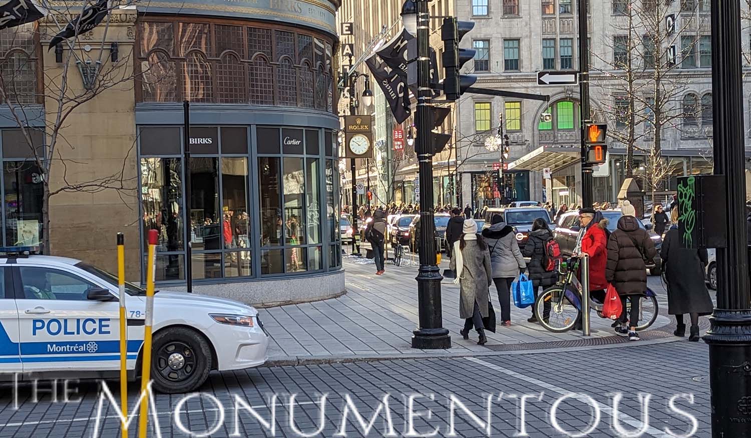
 Appearing on everything from street signs to police cars to official documents, the Montreal Logo can be found everywhere and on everything across the city of Montreal, Quebec, Canada. In becoming an icon that residents can embrace and visitors can engage with, the symbol highlights what it can mean to cultivate a sense of place that resonates with audiences of all types.
“Ville de Montréal”
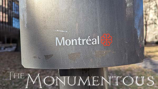 Jean Drapeau was the mayor of Montreal for nearly 30 years beginning in the 1950s. In the early 1980s, he decided it was time to modernize the Montreal coat of arms that had become the main symbol of the municipality. He commissioned Georges Huel, designer of the 1976 Olympics logo, to create something that was inspired by the city’s coat of arms but would be a much more modern design that was connected to the community.
Adopted by the Montreal City Council in 1981, the Montreal Logo was created out of the VM initials of the city, “Ville de Montreal (City of Montreal).” The lines at the center of the logo symbolize the city’s location as a crossroads of communication and civilization. Additionally, each one of the four petals is in the shape of a heart which was designed to represent the love that Montrealers have for their city.
While some were initially skeptical of the design and even described it as a “fancy four-leaf clover,” it wouldn’t be long before it was fully embraced in a way that could be seen and felt across the city. By creating such a powerful new icon that has come to instill a means of identity, the Montreal Logo highlights what it can mean to cultivate such feelings across an entire community.
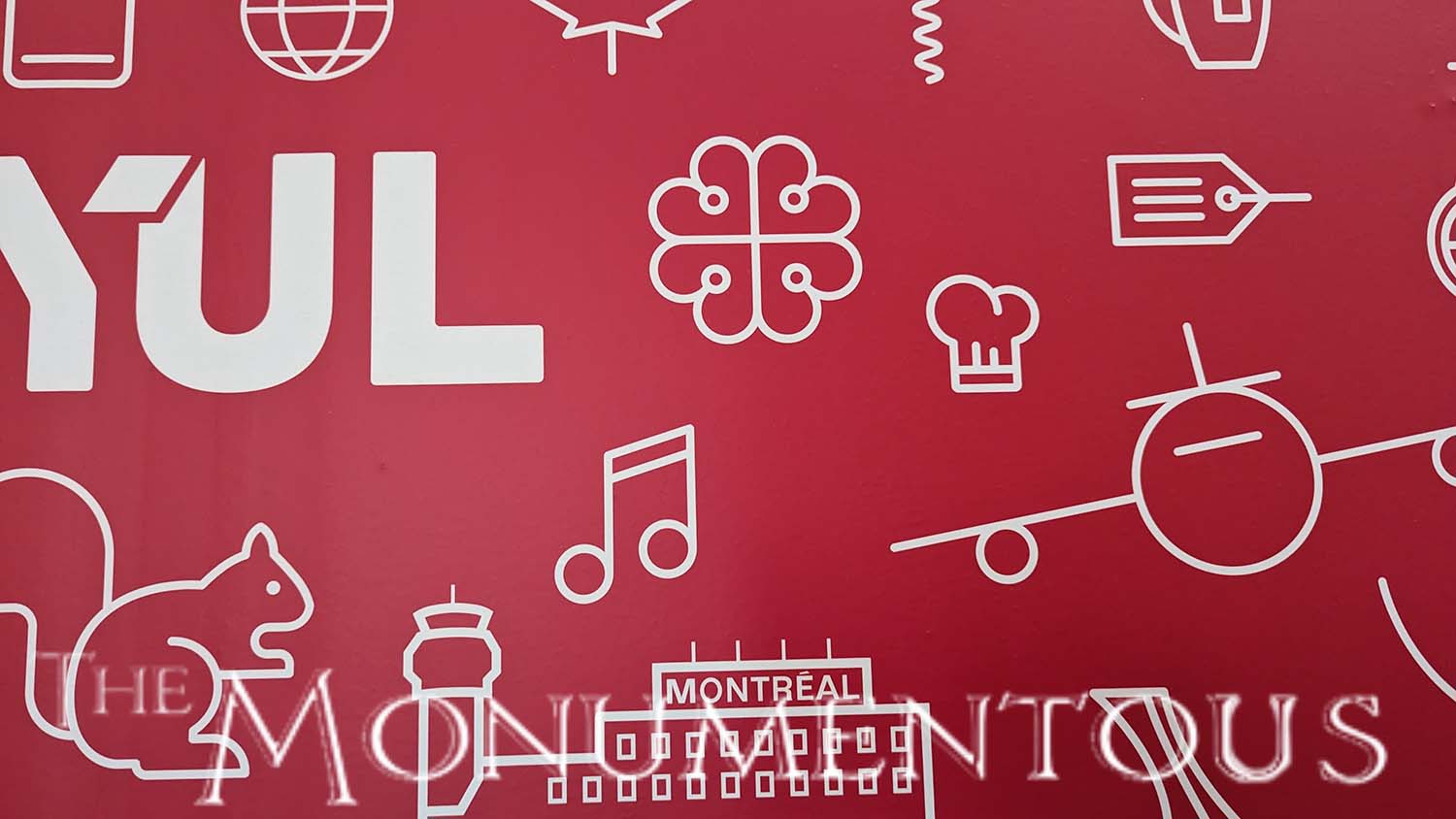
One of the Many Symbols of Montreal
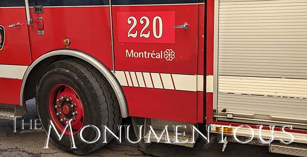 While numerous coats of arms, flags and logos have become emblematic of the city of Montreal, the Montreal Logo has become well-established as one of the most important of these symbols. Doing so highlights the power of an icon and identity for communities of all types and sizes.
