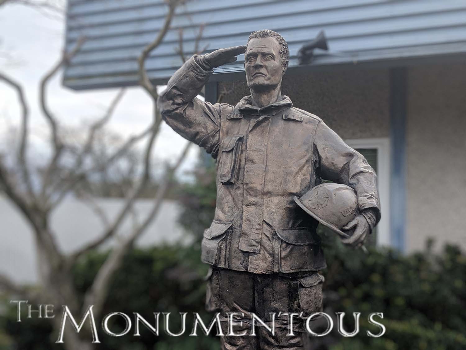
The impact that a monument or sculpture can have on a community, on a city or even on an entire country can be recognized in multiple ways. The direct and indirect social and economic impact of such pieces has been proven to resonate across communities and regions of all sizes. Whether they’re privately commissioned, made as a piece of public art or erected to serve a functional purpose, monuments and sculptures can become icons to enable positive change across these communities and regions.
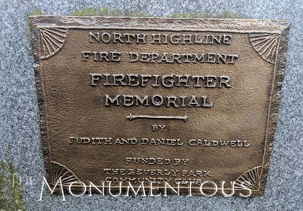 How should artists consider the impact their pieces might have on their surroundings though? In what way should those surroundings influence the idea for the piece itself? What kind of experiences can these pieces create in order to enable these sorts of positive changes for a community? For Judith and Daniel Caldwell, the answers to these questions are distinct for every single one of their sculptures, but what’s consistent is how all of these elements are rigorously considered.
Operating the Caldwell Sculpture Studio in Seattle, Washington, their sculptures have been part of various private, commercial, and public building projects, all of which have influenced their surroundings in distinct but powerful ways. To learn more about what goes into these pieces to eventually enable such positive changes to a space or community, I connected with Judith Caldwell to explore these details. We talked about the distinctions between “public art” and “art in public places”, how she facilitates audience engagement in different ways in her sculptures, how audience interpretation factors into her work, and much more.
Jeremiah Karpowicz: When and how do you consider the surrounding elements and community for one of your pieces?
Judith Caldwell: All of our public art projects are expected to be integrated physically and culturally, so we proceed from day one with an awareness of site’s surroundings and the history of the place. Every project is different, of course. Sometimes there is a story that comes with the site, and which gives us a good place to begin the research.
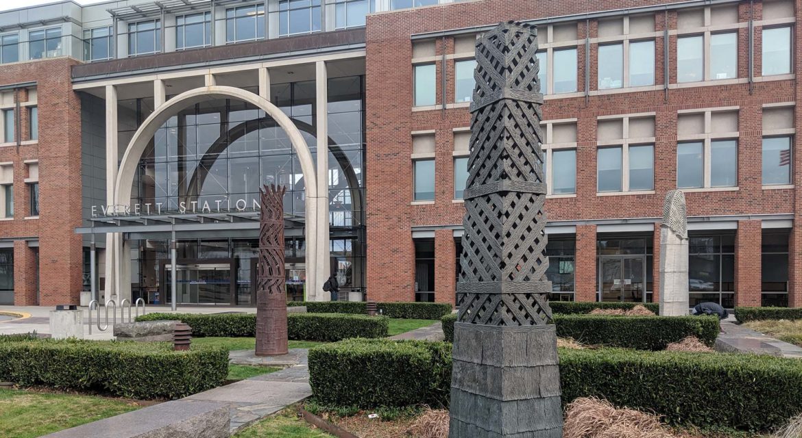
An example would be the Everett Station, where an art planner polled the community and determined that the industrial history of Everett was the subject people wanted to see addressed. This turned out to be a rich vein, full of fascinating stories regarding lumber and mining and the East Coast capital that controlled resource exploitation.
The Pillars of Industry were developed out of that research. The Mount Rainier Vision Chair, obviously, played off the school’s proximity to the mountain, the highest peak in the continental United States, and a magical, almost supernatural presence in the lives of the people here.
For a community college project we are working on now, we had to really investigate to find some way to express a special sense of place. It finally emerged that the city where the college was located was sitting on top of a huge aquifer that made it one of the most water-secure municipalities in the world, so we designed our project to reflect that feature.
Do you or have you directly engaged with the community when putting together a concept or idea for a piece of public art? When and how should an artist consider these factors?
We often make the distinction, when discussing our work, between “Public Art” and “Art in Public Places.” It helps people to understand the difference between a private or government entity purchasing a large piece of outdoor sculpture from an established artist famous for working with specific materials and forms, and that entity commissioning an (often relatively unknown) artist or artists to respond carefully to a specific site and program.
Since we fall into the latter category, we always are bound to consider community and site in the design. We often meet with community members to talk about ideas, and even try to integrate their own words and artwork into our sculptures, whenever possible.
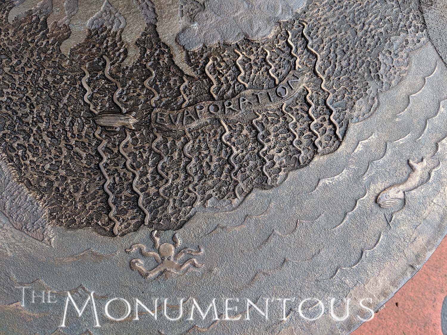
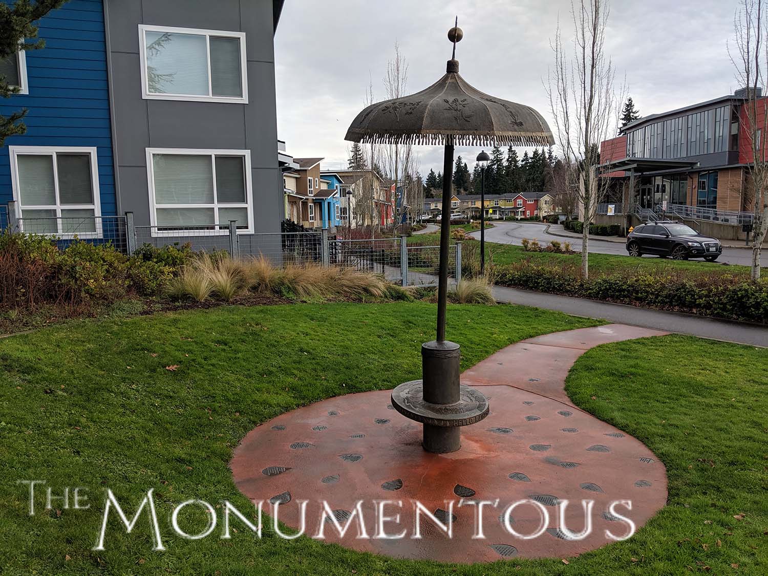
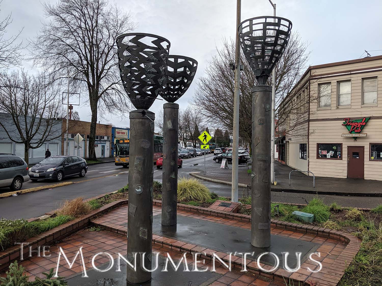
The Blue Sky Baskets are an example of a project that used kid’s drawings to create the ‘luggage stickers’ on the surface of the columns. Rainbrella and Raindrop Plaza used sentences—from teenagers, mostly—to answer the question “Hello Raindrop, Where in the World Have You Been?” that is on the front edge of the Rainbrella seat. Those sentences were then cast into the bronze raindrops in the plaza surface.
You mentioned a few of your pieces and I wanted to ask about the different experiences audiences are able to have with them. Do you think about how someone might directly engage with “Mount Rainier Vision Chair” versus what they can do with “Pillars of Industry”, where the engagement is a bit more passive?
In all of these cases, we are thinking about site, and the way the sites are used.
The little park in a housing development (mixed low income and market rate), like the one Rainbrella is located, is visited over and over by the same people, and is viewed at very close range. So there is a lot of visual detail to absorb over time. Plus, Rainbrella is very close to both an Early Learning Center and an Elementary School, so the pictorial and text information about the water cycle is aimed at children, and meant to be educational as well as humorous and fun. There are pictures and names of the plants growing in the adjacent bioswale. Hopefully, it all ties together. Many of the residents of the low-income housing adjacent complex are mothers who do not drive, lugging toddlers around, and older women doing errands on foot. We figured an extra place to sit would be welcome.
The Mount Rainier Vision Chair is just outside of a high school commons where the kids gather every day. When we designed it, more kids were using phones with cameras in them, and we wanted to create a sculpture that could feature in what later came to be called ‘selfies’. We had this idea that the rotation of the chair, allowing you to pick your view and/or your background could be a metaphor for the decisions you made in high school that informed aspects of your future life. Of course, we covered the chair with information about the mountain, in words and pictures. We also wanted to play with the idea of scale as an equalizer. A big kid sitting in the chair would experience his legs dangling, same as a smaller student.
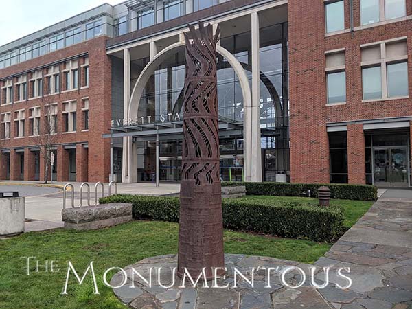
Alternatively, the Pillars of Industry are in a garden where people rarely take time to linger. If they choose to, they can come close and look inside of the Bronze Pillar and the Iron Pillar and see the words written there and notice the interesting textures on the surfaces of the sculptures. But mostly they are seen from a distance by people rushing in or out of the station and by people in cars in the parking lot or on nearby roadways. They were designed to give interest with their surfaces and details, but primarily to be large, significant forms in the landscape.
The Blue Sky Baskets were another example of artwork that included detail, but was very much what we called a ’30 mile an hour artwork’ in our presentation. In truth, the vast majority of people viewing these sculptures driving by or sitting at stoplights which surround the corner. There is little pedestrian traffic that would detour to view the sculptures at close range. That will change over time as the area inevitably becomes more high-density residential.
You mentioned “Blue Sky Baskets” and that’s a piece that clearly references the past. How much do you consider the way in which future communities might interpret any of your pieces?
That’s a fascinating question. We try to make work that has a timeless quality, in both form and subject matter. Since we create in bronze, we are aware that our artworks may be around for a very long time. Much of our text and pictorial detail refers to history, and to the natural world, subjects that we expect will hold interest over time.
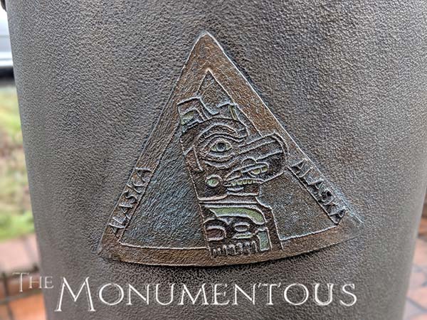
The Blue Sky Baskets do reference the past, in the sense that baskets are no longer the way we carry around all of our stuff. But the story of human migration, that is the bigger concept for the installation, is ongoing. In spite of the current political nastiness, people are of course going to keep moving from one place to another place in search of better lives for themselves and their children.
To wrap up, “The Big Eye” references the way people receive much of their knowledge and learning. How interested are you in knowing whether or not audiences realize this sort of underlying meaning versus interpreting such pieces in their own distinct or different manner?
The concepts behind these artworks constitute an intellectual architecture upon/around which to create a visual art piece. You hope that aspects of the thinking will come through in the finished work, and of course you can hedge your bet—as we often do—with text and pictures that help the viewer ‘get’ what we are trying to do. But the creator is only half of the conversation. The response of the viewer, whatever that is, is a creative act itself. They possess the meaning of the artwork in their own minds, and it belongs to them in a special, unique way, which is only right and proper.
When people ask me what an artwork is supposed to “be” or supposed to “do,” I tell them that the artwork is my unconscious ‘talking’ to their unconscious. I don’t always know why I make certain choices; I just know that they feel right. You may see things in the artwork that I do not myself understand, and did not myself (consciously) intend. That’s what gives art the perpetual ability to surprise, delight, frustrate, and confound both the creator and the viewer.
Learn more about Caldwell Sculpture Studio by visiting their site.
